How to Select the Right Fonts for Readability invites you to explore the pivotal role font selection plays in enhancing user experience and comprehension. Choosing the right font is not merely a design choice; it is a significant factor that influences attention span and information retention, as evidenced by various studies that have highlighted the intricate relationship between font style and readability.
This discussion will delve into the key characteristics that define readable fonts, the various types available, and the specific guidelines for selecting appropriate fonts based on different mediums and audiences. By understanding these elements, readers will be well-equipped to make informed decisions that improve the overall effectiveness of their written communications.
Importance of Font Selection in Readability
The choice of font plays a crucial role in enhancing readability, significantly impacting user experience and comprehension. It is not merely an aesthetic decision; rather, the font selected can influence how effectively content is conveyed to the audience. A well-chosen font can facilitate easier navigation through text, guiding readers to absorb information smoothly, while a poor choice can create barriers that hinder understanding and engagement.The relationship between font readability and cognitive processes such as attention span and information retention is well-documented.
Research indicates that certain fonts can improve focus and promote better memory recall. For instance, sans-serif fonts, such as Arial or Helvetica, are often perceived as more legible on digital screens, while serif fonts, like Times New Roman, have been traditionally favored in printed material due to their classic appearance. Notably, studies have shown that readers exhibit improved reading speed and comprehension when the text is presented in a clearly designed font.
Impact of Font Style on Readability
Text readability is not solely contingent upon the complexity or simplicity of the letters; it is also affected by various elements of design, including style, size, and spacing. The impact of font style on readability can be profound, as shown in several studies:
- A study conducted by the University of Reading found that participants reading text in a sans-serif font performed better on a comprehension test compared to those reading the same text in a serif font. This highlights the significance of font style in cognitive processing.
- Research published in the journal “Human Factors” demonstrated that larger fonts tend to enhance legibility, especially for older adults, who may struggle with smaller text sizes. The study concluded that text should be designed with optimal size to maximize readability across various demographics.
- An experiment by the American Psychological Association revealed that certain fonts, when used in educational materials, significantly improved information retention among students. For example, the font Comic Sans was found to be beneficial for children with learning difficulties, making it easier for them to engage with the content.
These findings illustrate the importance of selecting appropriate fonts not only for aesthetic value but also for maximizing the legibility and effectiveness of communication across different audiences. A thoughtful approach to font selection can lead to a more positive interaction with text, fostering better comprehension and retention of information among readers.
Key Characteristics of Readable Fonts
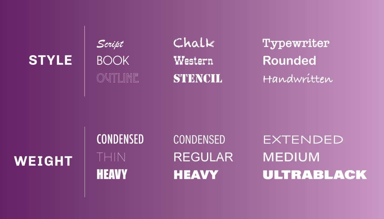
The selection of fonts plays a pivotal role in determining the overall readability of text. Understanding the key characteristics that enhance font readability can significantly impact how content is perceived by audiences. Various factors contribute to how easily a reader can absorb information, making it crucial to consider these elements in design.Several essential features of fonts contribute to their readability, including size, weight, style, and spacing.
The choice of these characteristics can influence the comfort of reading, thereby enhancing comprehension. Furthermore, the contrast between text and background colors is critical in ensuring that the content remains legible and accessible to all readers.
Essential Features of Readable Fonts
A comprehensive understanding of the essential features of readable fonts aids designers in making informed choices. The following characteristics are vital for enhancing readability:
- Font Size: A font size that is too small can strain the eyes, while excessively large sizes may disrupt the flow of reading. Optimal sizes typically range from 10 to 12 points for body text.
- Font Weight: Heavier weights can draw attention to key messages but should be used judiciously to avoid overwhelming the reader. Light and regular weights are often preferable for extensive reading.
- Font Style: Sans-serif fonts are generally considered more readable on screens, while serif fonts may be better suited for printed materials. The style should align with the content type and audience.
- Letter Spacing: Adequate spacing between letters can improve readability by preventing letters from appearing cramped. A standard tracking of 0 to 2% is often effective.
- Line Height: A line height of 1.5 to 1.75 times the font size creates sufficient space between lines, preventing a cluttered appearance in paragraphs.
The contrast between text and background colors is another vital aspect of font readability. High contrast, such as black text on a white background, enhances legibility and reduces eye strain, while low contrast can make reading challenging. It is essential to consider color blindness and other visual impairments when selecting color combinations.
Comparison of Font Characteristics and Their Effects on Readability
Understanding how various font characteristics affect readability can guide effective design choices. The table below summarizes different font features along with their impacts on readability:
| Font Characteristic | Recommended Range | Effect on Readability |
|---|---|---|
| Font Size | 10-12 points | Ensures comfortable reading; avoids eye strain. |
| Font Weight | Regular to Bold | Enhances emphasis without reducing legibility. |
| Font Style | Sans-serif for screens, Serif for print | Improves legibility based on medium. |
| Letter Spacing | 0-2% | Prevents letters from appearing cramped; improves flow. |
| Line Height | 1.5-1.75 times font size | Provides adequate space between lines for easier reading. |
| Contrast | High contrast recommended | Reduces eye strain; enhances overall legibility. |
Effective font selection can significantly enhance readability, improving the overall user experience and information retention.
Types of Fonts and Their Readability
Font selection plays a crucial role in enhancing the readability and overall aesthetic appeal of any text-based content. The choice of font not only affects how information is perceived but also impacts the ease with which it can be read. Understanding the different types of fonts and their inherent readability features is essential for effective communication, particularly in an increasingly digital world where information is consumed across various devices and screen sizes.
Categories of Fonts and Their Features
Fonts can generally be categorized into four primary types: serif, sans-serif, script, and display. Each category possesses unique characteristics that influence readability.
- Serif Fonts: These fonts feature small lines or decorative strokes at the ends of their letters. They are often perceived as more traditional and are typically used in print materials such as books and newspapers. An example is Times New Roman, known for its clarity in body text.
- Sans-serif Fonts: Lacking the decorative strokes of serif fonts, sans-serif fonts offer a clean and modern appearance, making them highly readable on screens. Arial is a popular choice for web content due to its straightforward design, which enhances legibility across various digital platforms.
- Script Fonts: Mimicking cursive writing, script fonts add a personal touch to designs but can be challenging to read in long passages. They are often used for invitations and decorative purposes. An example includes Brush Script, which is suitable for short, impactful statements rather than extensive text.
- Display Fonts: These fonts are designed to attract attention and are commonly used for headlines and advertisements. While they can create a strong visual impact, they may sacrifice readability if used excessively. Impact is a well-known display font that exemplifies this category.
Readability Across Devices and Screen Sizes
The readability of fonts varies significantly based on the medium through which they are viewed. On smaller screens, such as smartphones, sans-serif fonts are often preferred due to their simpler forms, which facilitate easier reading at reduced sizes. Fonts like Verdana and Helvetica have been optimized for screen use, ensuring clarity and legibility. In contrast, serif fonts may lose their effectiveness on smaller displays, where the intricate details can become blurred or indistinct.
For larger screens, such as monitors and televisions, both serif and sans-serif fonts can be effective depending on the context. For instance, serif fonts may be suitable for lengthy articles, providing a comfortable reading experience, while sans-serif fonts are favored for online content that requires quick scanning.
“The choice of font is fundamental not only for aesthetics but also for ensuring that the message is accessible and easy to grasp.”
Guidelines for Choosing Fonts for Different Mediums

Selecting the right font extends beyond aesthetics; it requires a nuanced understanding of the medium in which it will be displayed. Different platforms—be it print or digital—demand distinct approaches to font selection to ensure optimal readability and engagement. The medium influences how typefaces are perceived, emphasizing the importance of tailoring choices to meet specific needs and contexts.When choosing fonts, one must consider the inherent characteristics of print versus digital media.
Print materials, such as books and magazines, often benefit from serif fonts, which enhance readability in long texts due to their classic form and structure. On the other hand, digital mediums, including websites and presentations, typically favor sans-serif fonts that maintain clarity on screens, particularly at smaller sizes.
Considerations for Print vs. Digital Media
In distinguishing between print and digital media, several key factors should be taken into account:
1. Legibility
Print materials should utilize fonts that are easily legible at various sizes, while digital platforms must account for screen resolution and varying device sizes.
2. Context of Use
Print is often static, allowing for more intricate fonts, whereas digital content is dynamic, requiring fonts that can withstand varying lighting and display environments.
3. Color and Contrast
Print can leverage high contrast with ink and paper, while digital media must consider backlighting and color calibration differences across devices.The following best practices guide font selection based on the target audience and context:
1. Audience Demographics
Different age groups may respond better to certain styles. For example, younger audiences may favor modern and whimsical fonts, while older demographics typically prefer classic and straightforward typefaces.
2. Brand Identity
The selected font should align with the brand’s voice and personality, ensuring consistency across all mediums.
3. Readability in Context
For academic publications, a more traditional serif font is often appropriate, whereas digital marketing materials might benefit from a more playful sans-serif font that captures attention.A selection of recommended fonts is provided for specific purposes, ensuring each medium’s unique requirements are met:
Recommended Fonts for Specific Purposes
When selecting fonts for different applications, consider the following:
Websites
*Open Sans*
Known for its versatility and readability across devices.
*Roboto*
Offers a modern feel with excellent legibility.
Presentations
*Arial*
Simple, clean, and widely available for easy access.
*Helvetica*
Offers a professional appearance and clear visibility.
Print Materials
*Times New Roman*
A classic choice for formal documents and publications.
*Garamond*
Suitable for books and long texts, providing elegance and readability.These font choices not only accommodate specific mediums but also enhance readability, ensuring that the intended message is conveyed effectively to the audience.
Choosing the appropriate font is crucial in bridging the gap between content and audience, ensuring clarity, engagement, and professionalism.
Testing Font Readability

Testing font readability is a crucial step in the design process, as it directly influences how well the intended audience can consume written content. Effective font choice is not solely about aesthetics but also functionality, which necessitates thorough evaluation in real-world applications. By systematically testing fonts with actual users, designers can identify which typefaces enhance comprehension and which may hinder it.
Methods for Testing Font Readability with Real Users
Engaging real users in the assessment of font readability enables designers to gather valuable insights into how different typefaces perform in practice. This process typically involves several methodologies that prioritize user experience and feedback.
- Usability Testing: Conduct sessions where participants read texts in different fonts while observing their reading speed, comprehension, and ease of reading. This method provides direct feedback on font performance in a controlled environment.
- Surveys and Questionnaires: After participants engage with text samples, distribute surveys to gather subjective opinions on readability, aesthetic appeal, and overall comfort. Inquiries can assess how well users felt they could read the text and whether they experienced any strain.
- A/B Testing: Present two or more font options simultaneously to different user groups. Monitor engagement metrics such as time spent on the material, error rates in comprehension tasks, and even user preferences to identify which font yields better results.
Importance of Gathering Feedback on Font Choices
Collecting user feedback is essential to refining font selections. Feedback highlights areas of confusion and discomfort that may not be apparent during initial design phases. By actively seeking input from users, designers can make informed decisions about which fonts facilitate better readability and engagement.
“User feedback serves as a vital compass, steering designers towards font choices that resonate with their audience.”
Setting Up a Readability Test
Establishing a structured readability test involves careful planning and selection of participant criteria to ensure that results are valid and reliable. Firstly, define your target audience based on the demographics relevant to your content. For example, if the material is intended for children, select participants within that age group and perhaps an additional group of adults for comparative analysis.In terms of sample texts, choose passages that reflect typical content the users will encounter.
The text should vary in complexity and length to gauge readability comprehensively. Important components to include are:
- Font Selection: Choose a variety of fonts that you want to test for readability.
- Text Sample: Use standardized materials such as excerpts from books or articles that resonate with real-life reading scenarios.
- Duration: Allocate a specific time frame for participants to engage with the material and complete comprehension-related tasks.
By adopting these systematic approaches, you can effectively evaluate font readability, thus ensuring that the final choices enhance user experience and comprehension.
Accessibility Considerations in Font Selection

Selecting the right fonts is crucial not only for aesthetic appeal but also for ensuring that content is accessible to all users, including those with disabilities. Accessibility in font selection involves understanding how different font characteristics can impact readability for individuals with visual impairments and adhering to established accessibility standards. By prioritizing accessibility, designers can create inclusive experiences that allow everyone to engage with content effectively.
Accessibility Standards for Readable Fonts
Various accessibility standards guide font selection to enhance readability. Key guidelines include the Web Content Accessibility Guidelines (WCAG), which recommend ensuring sufficient contrast between text and background colors, as well as using fonts that are legible to a wide audience. According to WCAG, text should be resizable up to 200% without loss of content or functionality. Additionally, fonts should avoid overly decorative elements that may hinder readability, particularly for users with visual impairments.
Fonts Friendly for Individuals with Visual Impairments
When choosing fonts for individuals with visual impairments, specific characteristics significantly enhance readability. Fonts should be designed with clear letterforms, ample spacing, and a moderate x-height. Sans serif fonts, such as Arial or Helvetica, are generally considered more legible for these users due to their clean lines and simplicity. Moreover, using bold weights can help improve visibility against varying backgrounds.
Here are some important considerations:
- Use simple, sans serif fonts for better clarity.
- Ensure adequate spacing between letters, words, and lines.
- Avoid using italics or overly stylized fonts that may confuse letter differentiation.
Checklist for Selecting Accessible Fonts
Creating an accessible design requires careful evaluation of font choices. The following checklist can guide designers in selecting fonts that enhance accessibility for all users, particularly those with disabilities:
- Does the font have clear, distinguishable characters?
- Is there sufficient contrast between the text color and the background?
- Can the font size be increased without loss of clarity or readability?
- Are there options for bold weights to enhance visibility?
- Does the font support a wide range of weights and styles?
By adhering to this checklist, designers can create more inclusive content that accommodates the diverse needs of their audience.
The Role of Typography in Overall Design

Typography is a critical component of design that goes beyond mere aesthetics. It serves as a visual communication tool that interacts harmoniously with other design elements such as layout and color schemes. The careful selection and arrangement of fonts can significantly enhance the effectiveness of a design, making the message clearer and more engaging for the audience.The interaction between typography, layout, and color is essential for creating a cohesive design.
Font choices should complement the overall layout, ensuring that text is legible and effectively positioned within the design. The color scheme impacts how typography is perceived; for instance, using a high-contrast color for text against a background can improve readability. Moreover, typography can lead the viewer’s eye, drawing attention to specific areas of the layout, thereby creating a visual hierarchy.
Balancing Typography with Graphical Elements
Achieving a balance between typography and graphical elements is crucial for maintaining readability. When typography is well-aligned with images, icons, and other visual components, the overall design feels more unified. To ensure this balance, consider the following tips:
- Consistent Font Pairings: Use no more than two or three complementary fonts throughout the design to create a harmonious look. For example, a sans-serif font for headings paired with a serif font for body text can provide a pleasing contrast.
- Appropriate Font Sizes: Establish a clear hierarchy by varying font sizes. Headings should be larger and bold to capture attention, while body text should be smaller to ensure readability without overwhelming the viewer.
- Whitespace Utilization: Incorporate ample whitespace around text and graphical elements. This breathing room can enhance readability and make the design feel more open and accessible.
- Alignment and Spacing: Maintain consistent alignment for all text elements. Proper spacing between letters (kerning) and lines (leading) can improve readability and overall visual appeal.
Effective typographic hierarchies help establish clear communication and guide the viewer’s attention. A well-structured layout may feature a large, bold title that immediately conveys the main idea, followed by subheadings that introduce distinct sections of content. For instance, in a magazine layout, the title might use a dramatic serif font to evoke an emotional response, while body text is rendered in a clean sans-serif font to facilitate easy reading.
Well-implemented typography acts as a visual guide, leading the audience through the content and enhancing their understanding.
A powerful example of this can be observed in online articles where headings are strategically used to break up text, making it easier for readers to scan the content. Utilizing contrasting fonts and sizes for headings and body text not only creates visual interest but also reinforces the hierarchy of information, ensuring that the most important points are highlighted effectively.
Closure

In conclusion, selecting the right fonts for readability is an essential skill that enhances communication across various platforms. By considering factors such as font characteristics, user accessibility, and the interplay of typography with design elements, individuals can create visually appealing content that is also easy to read. As you apply the insights from this discussion, you will find that thoughtful font selection not only improves user engagement but also elevates the overall quality of your work.