How to Design a Visually Appealing Homepage serves as a fundamental guide for anyone looking to create an engaging online presence. A well-designed homepage not only captivates visitors with its aesthetic charm but also significantly influences user engagement and conversion rates. By understanding the key elements that contribute to a visually pleasing layout, one can enhance both the appeal and functionality of a website, ensuring a memorable first impression.
This guide explores essential design principles, effective layout strategies, and the importance of typography and imagery, providing insights into how these components work together to create an intuitive and attractive user experience. Focusing on mobile responsiveness and maintaining brand consistency further elevates the effectiveness of your homepage, making it a vital aspect of overall web design.
Importance of a Visually Appealing Homepage
A visually appealing homepage serves as the digital front door to a website, making it essential for capturing user interest immediately upon arrival. First impressions are formed within mere seconds, and these initial perceptions can significantly influence user engagement and retention. An effective homepage design not only attracts visitors but also encourages them to explore further, setting the tone for the entire user experience.The aesthetics of a homepage play a crucial role in driving conversion rates.
Research indicates that users are more likely to engage with websites that are visually appealing, often associating good design with credibility and trustworthiness. A well-designed homepage can lead to increased interaction, higher time spent on site, and ultimately, improved conversions—whether that be purchases, sign-ups, or other desired actions.
Key Elements of a Visually Pleasing Homepage
To achieve a visually appealing homepage, several key elements should be considered, each contributing to the overall effectiveness of the design. Understanding these components is essential for creating a compelling user experience.
- Color Scheme: A harmonious color palette not only represents a brand’s identity but also evokes emotions. For example, blue often conveys trust, while green suggests tranquility. The right colors can enhance user engagement and retention.
- Typography: The choice of fonts can significantly affect readability and overall aesthetics. Using a combination of font styles can create hierarchy and guide users through the content, making the information easier to digest.
- Imagery: High-quality images or graphics can capture attention and support the message of the homepage. Imagery should be relevant and enhance the content rather than distract from it.
- Layout: A clean, organized layout allows users to navigate easily. Important elements like calls to action should be strategically placed to guide users naturally through the homepage.
- White Space: Adequate white space helps to reduce clutter and improve focus on key elements. It allows for a more comfortable reading experience and can enhance visual appeal.
“In the realm of web design, aesthetics are not just about beauty; they are a critical component of user experience that can influence behavior.”
Incorporating these elements thoughtfully can result in a homepage that not only looks good but also performs well, leading to higher user satisfaction and better business outcomes. Recognizing the importance of visual appeal is essential for any website looking to make a lasting impact on its visitors.
Principles of Effective Design

Creating a visually appealing homepage is a fundamental aspect of web design, as it directly influences user engagement and retention. Effective design principles offer a framework that guides designers in achieving an aesthetically pleasing and functional interface. Understanding these principles—balance, contrast, alignment, and the strategic use of whitespace and color theory—can significantly enhance the user experience.
Balance, Contrast, and Alignment
Balance in design refers to the distribution of visual weight across a layout, aiming to create harmony and stability. A balanced homepage can be achieved through symmetrical or asymmetrical arrangements of elements. Symmetrical designs often convey formal elegance, while asymmetrical designs can create a more dynamic and modern look. Contrast plays a crucial role in guiding users’ attention and fostering clarity.
By using contrasting colors, sizes, and shapes, designers can differentiate between various elements, ensuring that critical information stands out. For example, a call-to-action button may be in a bold color that contrasts sharply with the background, making it easily identifiable.Alignment involves the arrangement of elements in relation to each other and to the overall layout. Proper alignment creates a sense of order and organization, leading to a more intuitive navigation experience.
Elements should align to a grid or specific guide to ensure a cohesive and professional appearance.
Whitespace in Layout
Whitespace, often referred to as negative space, is the area between and around elements on a page. The effective use of whitespace is vital for creating a clean and breathable layout. It enhances readability and allows users to focus on key content without feeling overwhelmed. Whitespace helps in preventing clutter, leading to a more engaging experience. For instance, increased spacing between text paragraphs or around images can significantly improve user comprehension and retention.
Color Theory and User Perception
Color theory examines how colors affect human emotions and perceptions, making it a powerful tool in design. Each color evokes specific feelings and associations, influencing user behavior on a website. For example, blue is often associated with trust and professionalism, commonly used in corporate web designs, while warm colors like red can evoke urgency and excitement, often used for sales promotions.Understanding color harmony—how colors work together—can enhance the visual appeal of a homepage.
Complementary color schemes can create striking contrasts, while analogous colors can produce a more subtle and harmonious look. Designers should also consider cultural differences in color interpretation, as colors may carry different meanings across various cultures.
“Color is a power which directly influences the soul.”
Wassily Kandinsky
Layout and Structure
The layout and structure of a homepage play a critical role in guiding visitors through the content seamlessly. An organized layout enhances user experience by making information accessible and easy to digest. Implementing an effective structure can significantly contribute to the visual appeal of a website, ensuring that users can navigate effortlessly and find the information they need.Effective organization of content requires a logical flow that aligns with users’ expectations and behaviors.
By arranging elements in a coherent manner, designers can facilitate a natural progression from one section to the next. A well-structured homepage typically employs a hierarchy that prioritizes essential information, which allows visitors to engage with the content intuitively.
Guidelines for Organizing Content
Establishing clear guidelines for content organization is essential for creating an effective homepage layout. The following principles can help achieve a logical flow:
- Prioritize Content: Identify key messages and features that should be highlighted. Place the most important information above the fold, ensuring it captures users’ attention immediately.
- Group Related Information: Cluster similar content together to aid comprehension. This can include sections for services, testimonials, and contact information that relate closely to one another.
- Utilize Visual Hierarchy: Employ size, color, and placement variations to indicate the importance of elements. Larger headings or contrasting colors can draw attention to critical areas of the page.
Methods for Utilizing Grids and Columns
Responsive design is a vital aspect of modern web development, and using grids and columns effectively can enhance a homepage’s functionality across various devices. Grids help maintain alignment and order, while columns facilitate the organization of content into digestible parts.To implement a grid layout, consider the following methods:
- CSS Grid Layout: This module allows for the creation of complex layouts with rows and columns. By defining grid areas, designers can place elements precisely where they are needed, ensuring that the layout adapts smoothly to different screen sizes.
- Flexible Columns: Employ flexible columns that resize automatically based on the screen width. This responsiveness can be achieved through CSS techniques like Flexbox, ensuring a user-friendly experience on both desktop and mobile devices.
- Breakpoints: Set specific breakpoints to adjust the layout for various screen sizes. By defining different styles for devices like tablets and smartphones, the design can maintain its integrity across platforms.
Effective Use of Headers and Footers
Headers and footers are essential components of a homepage, serving as navigation anchors that guide users throughout the site. A well-structured header can include navigation links, branding, and calls to action, while a footer can provide additional resources and information.To enhance the effectiveness of headers and footers, consider the following practices:
- Clear Navigation Links: Ensure that the header contains concise navigation links that lead to key sections of the website. This facilitates quick access to essential information, improving user experience.
- Consistent Branding: Incorporate the logo and branding elements in the header to reinforce brand identity. This consistency helps users recognize the site and builds trust.
- Informative Footers: Utilize the footer to provide additional information such as contact details, social media links, and site maps. This can help users find supplementary resources without cluttering the main content area.
Typography Choices
Typography plays a vital role in the overall aesthetic and functionality of a homepage. The selection and pairing of fonts are not merely a matter of personal preference; they significantly impact user experience, brand perception, and accessibility. Careful consideration of typography can create a cohesive visual identity that resonates with the target audience while enhancing the readability and engagement of the content.Choosing the right typography involves understanding font pairing and hierarchy, which are critical aspects of effective design.
Font pairing refers to the art of selecting complementary typefaces that work well together, creating a balanced and harmonious look. Meanwhile, hierarchy establishes a visual structure, guiding the viewer’s eye to the most important elements on the page. A well-defined hierarchy can be achieved through varying font sizes, weights, and styles, making it easier for users to navigate the content efficiently.
Font Pairing and Hierarchy
The selection of fonts should be thoughtful and strategic. Effective font pairing enhances the visual appeal of the homepage while ensuring clarity and engagement. It is essential to choose a combination of a primary typeface for headings and a secondary typeface for body text. This creates a clear distinction between different text elements and helps in maintaining a visual balance.
To further illustrate this point, the following guidelines can enhance font pairing:
- Complementary Styles: Pair a serif font with a sans-serif font. For example, using a classic serif font for headings and a clean sans-serif font for body text can create a sophisticated yet modern look.
- Contrast in Weight: Utilize a bold font for headlines and a lighter weight for the body to establish a hierarchy that directs attention to essential information.
- Consistent Sizing: Ensure that heading sizes are proportionate to body text sizes, typically with a ratio of 1.5 to 2 times the body font size for headings.
Implementing these strategies not only enhances visual appeal but also improves the overall user experience.
Readability and Accessibility
Readability and accessibility are paramount when selecting fonts for a homepage. A visually appealing design that compromises legibility can deter users and negatively impact engagement. Therefore, fonts must be chosen based on their clarity and ease of reading across various devices and screen sizes.Important considerations for enhancing readability include:
- Font Size: Utilize a minimum font size of 16px for body text to ensure comfortable reading on all devices.
- Line Spacing: Implement adequate line height (1.5 times the font size) to enhance readability and prevent text from appearing crowded.
- Color Contrast: Maintain a high contrast between text and background colors to ensure visibility. For instance, black text on a white background is universally readable.
Incorporating these elements not only improves the accessibility of the homepage but also demonstrates a commitment to user-centric design.
Typography and Brand Personality
Typography is a powerful vehicle for conveying a brand’s personality. The choice of typefaces communicates emotions and values, establishing an immediate connection with the audience. For example, a tech company may opt for modern and sleek sans-serif fonts to reflect innovation and forward-thinking. In contrast, a luxury brand might choose elegant serif fonts to evoke sophistication and exclusivity.To further understand how typography can enhance a brand’s identity, consider the following attributes associated with different font styles:
- Serif Fonts: Often associated with tradition and reliability; ideal for brands that wish to convey trust and authority.
- Sans-Serif Fonts: Modern and clean; suitable for brands that focus on innovation and simplicity.
- Script Fonts: Convey elegance and creativity; perfect for brands in the fashion or arts sectors that aim to express individuality.
By strategically selecting typography that aligns with their brand values, companies can create a strong visual identity that resonates with their target audience and fosters brand loyalty.
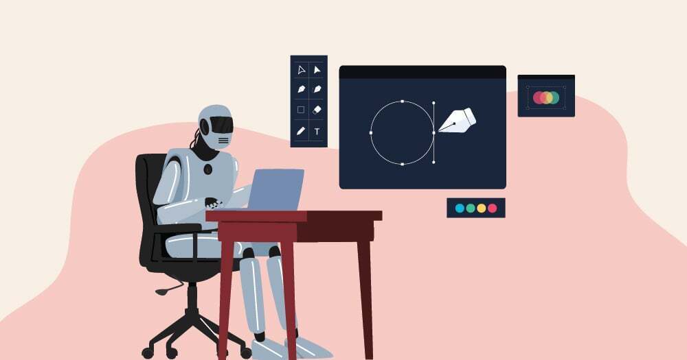
Imagery and Visual Content

The selection of imagery and visual content is a critical aspect of designing a visually appealing homepage. High-quality visuals can convey your brand’s message effectively, enhance user experience, and improve overall engagement. By carefully curating images that resonate with your branding and optimizing them for performance, you can create a homepage that not only looks great but also functions well.
Selection of High-Quality Images
When selecting images for your homepage, it is essential to choose high-quality visuals that reflect your brand identity. High-resolution images convey professionalism and credibility, while poor-quality visuals can detract from your overall aesthetic. Consider the following points when selecting images:
- Brand Alignment: Choose images that align with your brand’s color scheme, style, and message. For instance, if your brand promotes sustainability, images of nature or eco-friendly products can reinforce this message.
- Relevance: Ensure that the images are relevant to the content on the homepage. Irrelevant images can confuse users and distract from the main message.
- Emotional Appeal: Select visuals that evoke the desired emotional response from your audience. Engaging imagery can create a connection with users, making them more likely to explore your site further.
Optimizing Images for Faster Loading Times
Image optimization is crucial for ensuring that your homepage loads quickly, as slow load times can lead to higher bounce rates. To optimize images without sacrificing quality, consider the following techniques:
- Compression: Use image compression tools to reduce file sizes without compromising visual quality. Formats such as JPEG or PNG can be optimized effectively.
- Responsive Images: Implement responsive images using the ‘srcset’ attribute to serve different image sizes based on the user’s device, ensuring optimal loading times across all devices.
- Lazy Loading: Employ lazy loading techniques to load images only when they enter the viewport. This approach can significantly enhance page load speed by reducing the number of images loaded initially.
Role of Infographics and Illustrations
Infographics and illustrations play a significant role in enhancing user engagement on your homepage. They can make complex information more digestible, add visual interest, and encourage users to interact with your content. Here are some factors to consider:
- Information Simplification: Infographics can distill complicated data into easy-to-understand visuals, allowing users to grasp essential information quickly. For example, a visually engaging infographic summarizing your services or statistics can captivate users’ attention.
- Brand Personality: Custom illustrations can showcase your brand’s unique personality and creative edge. They can differentiate your site from competitors who may rely solely on stock imagery.
- Encouragement of Sharing: Visually appealing infographics and illustrations are more likely to be shared on social media, increasing your brand’s visibility and reach.
Color Schemes and Branding
A well-defined color scheme is essential in creating a visually appealing homepage that aligns with a brand’s identity. Colors have the power to convey emotions, influence perceptions, and even drive user behavior, making them a critical element of web design. Developing a cohesive color palette not only enhances aesthetic appeal but also reinforces brand recognition and loyalty.Creating a cohesive color palette involves selecting colors that harmonize well while reflecting the essence of the brand.
This process typically begins with identifying primary and secondary colors that encapsulate the brand’s personality. Utilizing tools such as color wheels and online palette generators can aid in visualizing how different colors interact. It’s important to consider the brand’s target audience, industry standards, and cultural implications of colors to ensure a suitable representation.
Psychological Effects of Colors on User Behavior
The psychological impact of colors is profound, affecting user emotions and decisions on a subconscious level. Understanding the implications of color choices can guide designers in crafting effective interfaces.The following insights highlight how specific colors can influence user behavior:
- Red: Often associated with urgency and excitement, red can stimulate appetite and encourage impulsive actions, making it popular for sales and promotions.
- Blue: Evoking feelings of trust and reliability, blue is commonly used by financial institutions and tech companies to foster a sense of security.
- Green: Symbolizing growth and tranquility, green is frequently employed by brands focusing on health, wellness, and sustainability.
- Yellow: This color conveys optimism and energy, often attracting attention and encouraging engagement, especially in youth-oriented brands.
- Black: Associated with sophistication and elegance, black is widely used in luxury branding to portray a sense of exclusivity.
“The right color scheme can enhance user experience and significantly impact conversion rates.”
Successful Color Schemes Used by Popular Websites
Examining color schemes from successful websites provides valuable insights into effective branding strategies. These color choices not only create a memorable aesthetic but also contribute to the overall functionality of the site.Several prominent brands exemplify successful color scheme utilization:
- Facebook: Utilizing a blue and white color palette, Facebook promotes feelings of trust and calmness while emphasizing user connection.
- Spotify: The vibrant green paired with black enhances its energetic and youthful persona, inviting users to explore music effortlessly.
- Airbnb: Their use of coral pink and muted tones creates a welcoming atmosphere, appealing to users looking for unique travel experiences.
- Starbucks: The green of Starbucks signifies sustainability and freshness, aligning with its brand message of quality and environmental consciousness.
- Trello: Featuring a bright blue and diverse palette, Trello’s design encourages creativity and collaboration, aligning with its project management tools.
Employing a well-considered color scheme can significantly impact a brand’s perception and user engagement. These examples illustrate the importance of aligning color choices with brand values and user expectations.
Interactive Elements
Incorporating interactive elements into a homepage can significantly enhance user engagement and experience. Features such as sliders, animations, and other dynamic content can capture attention and guide users through essential information. However, the implementation of these elements must be done thoughtfully to maintain a balance between visual appeal and functionality.The integration of interactive features requires a clear understanding of both design aesthetics and user experience principles.
For instance, sliders can be a powerful tool to showcase multiple images or pieces of content in a compact space. They allow users to navigate through visual stories or product offerings seamlessly. However, if not designed correctly, they can lead to user frustration, particularly if navigation controls are not intuitive or if the auto-slide feature moves too quickly.
Incorporation of Sliders and Animations
When designing sliders and animations, it is essential to focus on their placement and timing. The following strategies can help ensure these elements enhance rather than detract from the user experience:
- Clear Navigation: Ensure that navigation controls for sliders are prominently displayed and easily accessible. Users should be able to pause, play, and manually navigate through content without confusion.
- Responsive Design: Sliders should be mobile-friendly, scaling appropriately across devices to provide a consistent experience. This adaptability fosters a more inclusive design approach.
- Content Relevance: The content within sliders should be relevant and engaging. Each slide must communicate a clear message or call to action, enhancing the overall storytelling aspect.
- Animation Timing: Animations should be smooth and not overly distracting. A good rule of thumb is to limit animations to essential interactions and transitions that guide users rather than overwhelm them.
Balancing Visual Appeal and Functionality
Achieving a balance between aesthetic appeal and functional usability is crucial in interactive design. Overly complex animations or flashy sliders can distract users or make navigation cumbersome. Therefore, it is vital to integrate these elements with the following considerations:
- User-Centric Design: Prioritize user needs by ensuring that interactive elements serve a purpose, such as enhancing navigation or providing important information.
- Loading Speed: Optimize interactive components to ensure they do not hinder page loading times. Slow-loading content can lead to user abandonment and negatively impact overall site performance.
- Accessibility Standards: Ensure that all interactive features are accessible to users with disabilities. Implementing keyboard navigation, screen reader compatibility, and appropriate contrast ratios is essential.
User-Friendly Interactive Elements
To ensure that interactive elements are user-friendly, consider the following methods:
- Feedback Mechanisms: Provide immediate feedback when users interact with elements, such as hover effects, button animations, or loading indicators. This reinforces actions and enhances user confidence.
- Consistent Design Language: Maintain consistency in design and interaction patterns across all interactive elements. Users should feel familiar with the interface regardless of the section they are navigating.
- Testing and Iteration: Regularly test interactive elements with real users to gather feedback and make necessary adjustments. User testing helps identify pain points and areas for improvement.
“Interactive design is not just about aesthetics; it’s about creating a seamless and engaging experience that centers on the user’s journey.”
Mobile Responsiveness
Designing for mobile users has become essential in today’s digital landscape. With a significant portion of web traffic coming from mobile devices, ensuring that your homepage is responsive and user-friendly across all screen sizes is crucial. A visually appealing homepage that is not optimized for mobile can lead to a poor user experience, driving potential visitors away.Creating responsive layouts involves utilizing flexible grids and layouts that adapt seamlessly to different screen sizes.
This flexibility can be achieved through various techniques, including CSS media queries, which allow designers to apply specific styles based on the characteristics of the device being used. Additionally, employing a mobile-first design approach ensures that the mobile version of a site is considered first, allowing for a more streamlined user experience.
Techniques for Creating Responsive Layouts
Implementing responsive design requires a set of techniques that prioritize adaptability and user experience. Here are several important methods to consider:
- Fluid Grids: Use relative units like percentages rather than fixed units like pixels. This allows your layout to adjust fluidly to the screen size, ensuring elements resize appropriately.
- Media Queries: Apply CSS rules that enable different styling for various screen resolutions. For example, adjusting font sizes or layout styles based on whether the visitor is using a mobile device or desktop.
- Flexible Images: Utilize CSS to make images responsive by setting their maximum width to 100%. This prevents images from overflowing their containing elements and maintains visual integrity across devices.
- Viewport Meta Tag: Include the viewport meta tag in the HTML to control the layout on mobile browsers. This tag helps instruct the browser on how to adjust the page’s dimensions and scaling to fit the device’s screen.
Prioritizing Content for Mobile Display
When designing for mobile, it is important to prioritize content effectively to maintain a visually appealing layout without sacrificing usability. Identifying which elements are most important for mobile users can significantly enhance their experience.To achieve this, consider the following strategies:
- Content Hierarchy: Establish a clear hierarchy of information. Place the most critical content at the top of the page for easy access, allowing users to quickly find what they need without excessive scrolling.
- Minimize Clutter: Remove unnecessary elements and streamline the content. A clean, focused layout is particularly vital on smaller screens, where space is limited.
- Utilize Collapsible Elements: Implement accordions or dropdowns for less critical information. This approach keeps the interface clean while still providing access to additional details when needed.
- Touch-Friendly Navigation: Design buttons and links that are easy to tap with a finger. Ensure that touch targets are adequately spaced to avoid accidental clicks, which can frustrate users.
By adopting these techniques and considerations, your homepage can achieve a responsive design that meets the needs of mobile users while retaining its visual appeal and functionality.
Consistency and Branding
Maintaining consistency in design is a cornerstone of effective web development, particularly for a homepage. A cohesive visual experience enhances user navigation and fosters trust and recognition among visitors. This principle extends across all pages of a website, ensuring that users can easily associate the design with the brand, regardless of where they are on the site.The application of brand elements such as logos, colors, and fonts must be uniform to solidify brand identity.
A well-defined brand presence not only communicates professionalism but also enhances user retention by creating familiarity. To achieve this, the following brand elements should be integrated consistently throughout the homepage design:
Application of Brand Elements
Brand elements serve as the visual language of a website, and their consistent application can significantly impact user perception and engagement. The following methods can be employed to ensure uniformity in brand representation:
1. Logo Placement
Position the logo prominently, typically in the top left corner of the homepage. This location is instinctively where users look first, reinforcing brand visibility.
2. Color Palette
Choose a limited color palette that encapsulates the brand’s identity. Utilize these colors across all elements, including buttons, backgrounds, and text, to create a harmonious look.
3. Typography
Select a couple of typefaces that reflect the brand’s personality. Consistently apply these fonts for headings, subheadings, and body text. This fosters readability and ensures a unified aesthetic.
4. Visual Elements
Incorporate brand-specific imagery and icons that resonate with the brand’s mission. These elements should be used throughout the homepage and other pages for cohesive storytelling.
5. Tone and Voice
While primarily related to content, the tone and voice of the website should also align with brand values. Consistent messaging enhances the overall user experience and brand perception.
Creating a Style Guide
A style guide serves as a comprehensive reference for maintaining design consistency. It provides guidelines on how brand elements should be applied across various platforms and pages. Developing a style guide can be achieved through the following steps:
Document Brand Colors
Specify the primary and secondary colors, including their hex codes, to ensure accurate reproduction across digital platforms.
Define Typography Guidelines
Artikel the fonts to be used, including sizes and weights for different text hierarchies. This should include examples of how to implement the typography in various contexts.
Logo Usage Instructions
Include specifications on how the logo should be displayed, including spacing requirements, acceptable variations, and backgrounds.
Visual Elements and Icons
Establish guidelines for any icons or graphic elements, detailing their usage and style to ensure they align with the overall brand aesthetic.
Example Layouts
Provide visual examples of preferred layouts for different types of pages, showcasing how brand elements come together in real contexts.A well-crafted style guide not only streamlines the design process but also ensures that anyone involved in web development understands the importance of brand consistency, ultimately leading to a more impactful online presence.
User Experience (UX) Considerations
In designing a visually appealing homepage, user experience (UX) plays a pivotal role. A homepage should not only attract users visually but also guide them seamlessly through the content and functionalities available. Balancing aesthetics with user-centric design principles enhances the overall experience, leading to higher user satisfaction and retention.To achieve a superior user experience, understanding the methods and techniques for effective navigation is essential.
Properly structured navigation enables users to locate information swiftly and intuitively. One effective approach to ensure this is through a well-thought-out site hierarchy, which organizes content in a logical manner. Implementing breadcrumb navigation allows users to see their current location within the site, making it easier to backtrack if needed. Additionally, incorporating a search bar can significantly streamline the navigation process, granting users direct access to specific content without unnecessary clicks.
Techniques for Gathering User Feedback
Gathering user feedback is vital for refining homepage design and enhancing user experience. Employing a variety of feedback techniques allows designers to understand user preferences, pain points, and interaction patterns. Some effective methods include:
- Surveys: Distributing short surveys post-interaction can yield immediate insights regarding user satisfaction and areas for improvement.
- Usability Testing: Observing real users as they navigate the homepage can highlight usability issues that may not be apparent to the designers.
- Analytics Tools: Utilizing tools to track user behavior, such as click-through rates and bounce rates, can reveal trends and identify potential navigation hurdles.
- Focus Groups: Engaging small groups of users to discuss their experiences can generate qualitative feedback that quantitative methods might miss.
By employing these methods, designers can continuously iterate and refine the homepage based on real user experiences, ensuring that it meets the evolving needs of its audience.
Importance of Accessibility Standards
Accessibility standards are fundamental in ensuring that a homepage is usable by everyone, including individuals with disabilities. Designing with accessibility in mind not only broadens the reach of the website but also demonstrates a commitment to inclusivity. Adhering to established guidelines, such as the Web Content Accessibility Guidelines (WCAG), helps in creating content that is perceivable, operable, understandable, and robust.Elements to incorporate for enhancing accessibility include:
- Alternative Text for Images: Providing descriptive alt text allows users with visual impairments to understand visual content through screen readers.
- Keyboard Navigation: Ensuring that all interactive elements are navigable using a keyboard enhances usability for individuals who cannot use a mouse.
- Color Contrast: Adhering to color contrast ratios improves readability for users with visual impairments and ensures that content is accessible to all.
- Semantic HTML: Utilizing proper HTML elements enhances accessibility by helping screen readers interpret the structure of content appropriately.
By prioritizing accessibility, designers create an inclusive online environment that accommodates diverse user needs, ultimately contributing to a more positive overall user experience.
End of Discussion
In conclusion, mastering the art of homepage design is crucial for establishing a successful online platform. By implementing the principles discussed, from effective use of color schemes and typography to enhancing interactivity and mobile responsiveness, you can create a homepage that not only draws users in but also keeps them engaged. A well-crafted homepage is more than just an aesthetically pleasing introduction; it is an essential tool for building a strong brand identity and ensuring a positive user experience.