Exploring How to Create a Navigation Menu in WordPress reveals the essential role that navigation plays in enhancing user experience and website functionality. A well-structured navigation menu serves as a roadmap for visitors, guiding them seamlessly through your content and ensuring they can easily locate key information. With various types of navigation menus available, understanding their components and setup is crucial for any website owner seeking to engage their audience.
This guide will walk you through the process of establishing an effective navigation menu, from setting up the menu structure to customizing its appearance and ensuring it is responsive. You will also learn how to troubleshoot common issues and implement best practices for optimal design, making your WordPress site both user-friendly and visually appealing.
Understanding Navigation Menus in WordPress
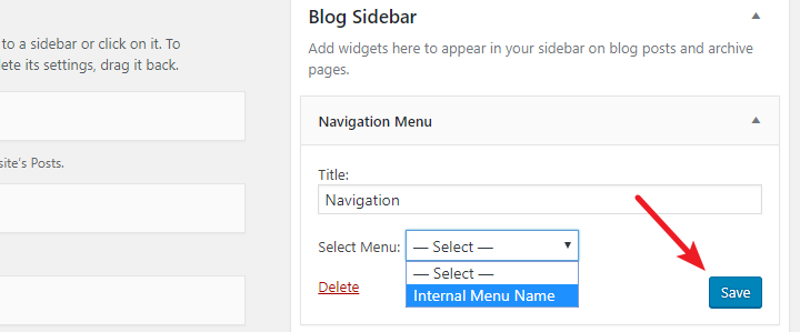
Navigation menus serve as a vital component of any WordPress website, guiding visitors through the various pages and sections with ease. They enhance user experience by ensuring that important content is easily accessible, which can lead to increased engagement and reduced bounce rates. In a well-structured website, navigation menus contribute significantly to the overall functionality and aesthetic appeal, allowing users to find information quickly and efficiently.WordPress offers various types of navigation menus, each tailored to meet the diverse needs of website owners and users.
These menus can be customized to fit the specific layout and design of the website, ensuring that they not only serve a functional purpose but also align with the site’s branding. Commonly utilized types of navigation menus include primary menus, secondary menus, footer menus, and mobile menus. Each type serves unique purposes, catering to different aspects of user interaction and content organization.
Elements of a Navigation Menu
Understanding the elements that make up a navigation menu is crucial for creating an effective user interface. A well-designed navigation menu typically includes several key components that enhance its functionality and accessibility. The following elements are commonly found in navigation menus:
- Menu Items: These are the individual links that lead users to specific pages or sections of the website. Menu items should be clearly labeled to reflect the content they represent.
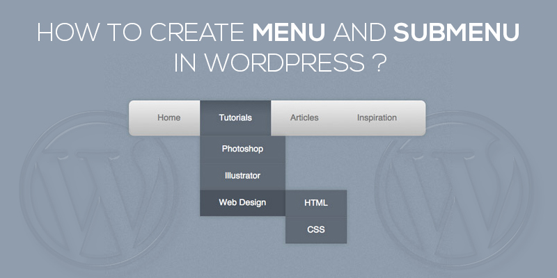
- Submenus: Submenus can be used to organize related links under a primary menu item. This hierarchical structure allows for enhanced organization, making it easier for users to explore related content.
- Custom Links: Website owners can add custom links to external websites or resources, providing users with easy access to relevant information outside the primary site.
- Icons: Incorporating icons alongside text can improve visual appeal and comprehension. Icons can symbolize various categories or actions, aiding users in quickly identifying menu functions.
- Dropdown Menus: Dropdown menus allow for compact organization of multiple links under a single menu item, preserving horizontal space while offering comprehensive access to content.
The combination of these elements creates a cohesive navigation experience, allowing users to navigate the website intuitively. By prioritizing clarity and ease of use, website owners can design navigation menus that not only meet the expectations of their audience but also enhance the overall usability of their site.
Effective navigation menus are essential for improving user experience and ensuring visitors can access the information they seek with minimal effort.
Setting Up WordPress Menu Structure
To effectively guide visitors through your WordPress site, setting up a well-structured navigation menu is essential. This process involves accessing the menu settings from the WordPress dashboard and understanding how to organize your menu items for optimal user experience.To begin, you will access the menu settings directly from the WordPress dashboard. This is crucial as it provides the foundation for your menu structure.
Once you are in the menu settings, you can see various options that allow you to customize your navigation according to your preferences.
Accessing the Menu Settings
To access the menu settings, follow these steps:
- Log in to your WordPress dashboard.
- Navigate to the “Appearance” section on the left-hand sidebar.
- Select “Menus” from the dropdown options.
This navigation allows you to enter the menu management area, where you can create new menus or edit existing ones.
Understanding Menu Locations
WordPress themes often provide specific locations for menus, which can enhance the layout and usability of your site. These locations typically include:
- Primary Navigation: This is usually the main menu displayed at the top of the site.
- Footer Menu: A menu often found in the footer area, useful for additional links.
- Social Links Menu: A designated area for links to social media platforms.
- Mobile Menu: A specific menu designed for mobile devices.
Understanding these locations helps in assigning the menus effectively based on your site’s design and needs.
Creating a New Menu and Assigning It
Creating a new menu and assigning it to a specific location involves straightforward steps:
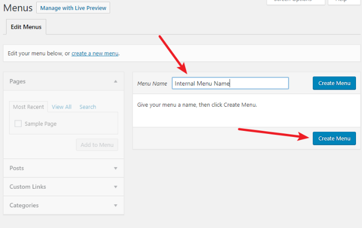
- In the Menus screen, click on the “Create a New Menu” link.
- Give your new menu a name for easy identification.
- Use the “Add menu items” section to select pages, posts, or custom links you wish to include in your menu.
- Once your items are selected, click the “Add to Menu” button.
- Arrange the menu items by dragging and dropping them in the desired order.
- To assign the menu to a location, check the box for the desired location under “Menu Settings”.
- Finally, click the “Save Menu” button to apply your changes.
Following these steps ensures that your new menu is well-structured and effectively integrated into your WordPress site, enhancing user navigation and overall site functionality.
Adding Items to Your Navigation Menu
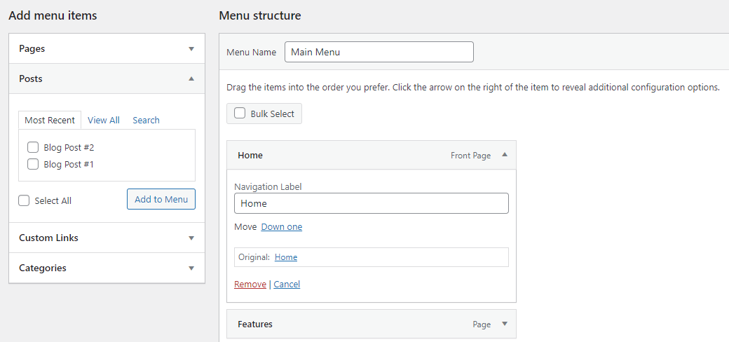
Incorporating various elements into your navigation menu is essential for enhancing user experience and site structure. This aspect of WordPress allows you to connect your audience with different parts of your website seamlessly. You can add pages, posts, custom links, and categories to create a comprehensive navigation menu that meets your visitors’ needs.To begin adding items to your navigation menu, access the WordPress dashboard and navigate to the “Menus” section under the “Appearance” tab.
From here, you will find options to include different types of content. The following Artikels the steps to add various items effectively.
Adding Pages, Posts, Custom Links, and Categories
Adding diverse content types will enrich your navigation menu, making it more functional. The following points detail how to incorporate each type:
- Pages: Pages are static or major sections of your site. To add a page, select the desired pages from the list under the “Pages” panel and click “Add to Menu.” This will automatically place the pages in your menu structure.
- Posts: Individual posts are often used for blogs or articles. Select the relevant posts from the “Posts” panel and click “Add to Menu.” This allows you to highlight specific articles.
- Custom Links: Custom links are essential for directing users to external URLs or specific sections within your website. Enter the URL and link text in the “Custom Links” section, then click “Add to Menu” to include it in your navigation.
- Categories: Categories help group related posts. Select categories from the “Categories” panel and click “Add to Menu.” This organizes your content and makes it easier for users to find related posts.
Rearranging Menu Items and Creating Submenus
Organizing the structure of your navigation menu enhances usability. You can rearrange the items by simply dragging and dropping them into your desired order. To create submenus, drag an item slightly to the right beneath its parent item. This action will nest the menu item, indicating it as a submenu. Submenus help in categorizing related links, providing a cleaner and more accessible navigation experience.
Removing Items from the Navigation Menu
Removing items that are no longer relevant can declutter your navigation menu and improve user interaction. To remove an item, click the downward arrow next to the menu item, which opens up options. Click “Remove” to eliminate it from the menu.
Removing unnecessary items not only streamlines navigation but also helps in directing users towards the most important content on your site.
Be aware that when you remove an item, all associated links will also be deleted from the menu structure. It is crucial to evaluate the implications of removing items, as it may affect user navigation and the site’s overall usability.
Customizing the Appearance of Navigation Menus
The visual presentation of navigation menus in WordPress can significantly enhance user experience and site aesthetics. Customizing these menus allows website owners to align their site with their branding and improve usability. Through the WordPress Customizer, users can easily adjust various aspects of their navigation menus without any coding knowledge. The WordPress Customizer offers several options to style navigation menus, including font settings, color choices, and layout adjustments.
These modifications can be accessed by navigating to the Appearance section in the WordPress dashboard and selecting Customize. Here, users can make changes that reflect on the website in real-time.
Styling Options in WordPress Customizer
The WordPress Customizer provides a user-friendly interface for styling navigation menus. Here are key areas where you can customize your menu’s appearance:
- Menu Color: Choose colors for your menu text and background to ensure they stand out. A contrasting color scheme can improve readability and visual appeal.
- Font Style: Select from various fonts available in the theme or upload custom fonts. Consistent typography contributes to the overall branding.
- Menu Position: Adjust the position of your menu to the top, side, or footer of the page. The location can affect how easily users navigate your site.
- Hover Effects: Implement hover effects such as color changes or underlines to provide visual feedback as users interact with the menu.
Customizing these elements helps create a navigation menu that is not only functional but also visually appealing, encouraging visitors to explore the site further.
CSS Code Snippets for Enhanced Visual Appeal
While the Customizer offers basic styling options, using CSS can provide even greater flexibility and precision in design. Below are some CSS code snippets to enhance the visual appeal of your navigation menu:
/* Change background color of the menu - / .main-navigation background-color: #333; /* Change text color of menu items - / .main-navigation a color: #fff; text-decoration: none; /* Add hover effect for menu items - / .main-navigation a:hover color: #ffcc00;
These snippets can be added to the Additional CSS section in the Customizer. By implementing these styles, the menu will not only be more attractive but also provide a better user experience with clear visual cues.
Incorporating Icons or Images into Menu Items
Adding icons or images to navigation menu items can enhance usability by visually communicating the purpose of each link. This can make the navigation process intuitive and enjoyable for users. Here are effective methods for integrating icons or images:
- Using Font Awesome Icons: Font Awesome is a popular library that provides scalable vector icons. By including the Font Awesome stylesheet in your theme, you can easily insert icons beside menu items using HTML tags. For example:
<i class="fa fa-home"></i> Home - Custom Images: For a more personalized approach, you can upload custom images for each menu item. This can be achieved by using the Menu Item CSS Classes feature to target specific items and apply background images via CSS.
- Plugin Solutions: Various plugins, such as “Menu Icons,” allow users to add icons to menu items without coding. These plugins simplify the process and provide a wide variety of icons to choose from.
Incorporating these visual elements can significantly enhance the overall functionality and attractiveness of your navigation menus, making it easier for visitors to engage with your content.
Utilizing Plugins for Advanced Navigation Features
In the world of WordPress, plugins play a crucial role in enhancing the functionality of your website, particularly when it comes to navigation menus. With a wide array of plugins available, website owners can implement advanced features that can significantly improve user experience and site aesthetics. This section will delve into popular plugins designed to enhance navigation menus, demonstrate how to install and configure a mega menu plugin, and explore additional features that these plugins can offer.
Popular Plugins for Enhancing Navigation Menus
A variety of plugins are available that can transform standard WordPress navigation menus into more dynamic and feature-rich components. These plugins are easy to install and can be configured with minimal effort. Below are some popular plugins that can help you enhance your navigation menus:
- Max Mega Menu: This plugin allows you to create responsive mega menus that can include images, widgets, and other elements, enhancing the overall visual appeal of your site.
- WP Mega Menu: A user-friendly plugin that lets you easily build mega menus with drag-and-drop functionality, making it accessible for users with all levels of expertise.
- UberMenu: Known for its extensive customization options, UberMenu allows for the creation of highly tailored menus, complete with icons and rich content.
- Elementor: While primarily a page builder, Elementor includes a nav menu widget that can be customized extensively, integrating seamlessly with other design elements.
Installing and Configuring a Mega Menu Plugin
To create a mega menu, you will first need to install a suitable plugin. Below is a step-by-step guide on how to install and configure the Max Mega Menu plugin:
- Navigate to the WordPress dashboard and select Plugins from the menu.
- Click on Add New and search for “Max Mega Menu.”
- Once found, click on Install Now and then Activate the plugin.
- After activation, go to Appearance > Menus to create or edit your menu.
- Enable the mega menu option for your selected menu items, allowing for sub-items and additional layout options.
- Use the Mega Menu Settings to adjust the configurations, such as the layout, icon selection, and widget placement.
This process is straightforward, making it easy for users to upgrade their navigation menus without any coding knowledge.
Additional Features Offered by Navigation Menu Plugins
Navigation menu plugins not only enhance the aesthetic aspect of menus but also offer additional functionalities that improve user interaction. These enhancements can lead to better navigation and usability of your website. Some notable features include:
- Responsive Design: Many plugins ensure that menus are mobile-friendly, adjusting layouts for different screen sizes and devices.
- Sticky Menus: This feature keeps the menu visible as users scroll down the page, facilitating easier access to navigation links.
- Animation Effects: Plugins often allow for various animations when menus are opened or closed, providing a more engaging user experience.
- Custom Fonts and Colors: Enhanced customization options enable users to align menu styles with their site’s branding, including font styles, sizes, and colors.
“Investing in navigation menu plugins can significantly elevate the user experience on your website, making it easier for visitors to find the information they need.”
Mobile Responsiveness of Navigation Menus
In today’s digital landscape, ensuring that your WordPress website is mobile-friendly is crucial. A significant portion of users access websites via mobile devices, making responsive design essential for navigation menus. A well-designed mobile navigation menu enhances user experience, promotes engagement, and can contribute positively to rankings.Responsive design for navigation menus in WordPress involves creating menus that adapt seamlessly to various screen sizes, from desktop monitors to smartphones.
This adaptability ensures that all users can navigate your site effortlessly, regardless of the device they are using. Here are some techniques to ensure your menus maintain functionality and aesthetic appeal across different devices.
Techniques for Ensuring Menu Adaptability
To achieve a responsive navigation menu, consider the following techniques:
- Use a Mobile-First Approach: Designing for the smallest screens first allows you to gradually enhance the experience for larger devices. This method ensures that essential features are prioritized and effectively displayed on mobile devices.
- Utilize CSS Media Queries: Media queries enable you to apply specific styles based on the device’s characteristics, such as screen width. This allows for adjustments to font sizes, padding, and layout, ensuring your menu looks great on all screens.
- Implement Hamburger Menus: This popular design choice condenses navigation options into a single icon, freeing up valuable screen space on mobile devices. Users can expand the menu to view options as needed, maintaining a clean interface.
- Ensure Touch-Friendly Design: Navigation menus should be easy to tap on mobile devices. Ensure that buttons are appropriately sized and spaced to prevent user frustration when navigating the site.
- Test with Responsive Design Tools: Tools such as Google Chrome’s Developer Tools allow you to simulate various devices and screen sizes, providing insight into how your navigation menu performs across different environments.
Effective Testing of Navigation Menus
Testing the responsiveness of navigation menus is paramount to ensure functionality on all devices. The following methods are recommended for effective testing:
- Use Browser Developer Tools: Most modern web browsers come equipped with developer tools that allow users to view and interact with the website as if on different devices. This feature is instrumental in identifying issues with the navigation menu.
- Conduct Real Device Testing: Testing on actual devices provides the most accurate feedback. Ensure to test on various smartphones and tablets with different operating systems to capture a wide range of user experiences.
- Engage User Testing: Involving actual users in testing can provide valuable insights. Observing how users interact with the navigation menu can reveal areas needing improvement.
- Monitor Analytics Data: Tools like Google Analytics can provide insights into user behavior. High bounce rates or low engagement metrics on mobile devices can indicate issues with navigation that need to be addressed.
Troubleshooting Common Navigation Menu Issues
When managing navigation menus in WordPress, users may encounter various challenges that can hinder the effectiveness of their website’s navigation. Understanding these common problems and their resolutions is vital for maintaining a seamless user experience. This section will Artikel prevalent issues related to navigation menus and provide actionable steps to rectify them.
Identifying Missing Menu Items
One common issue faced by users is the disappearance of menu items. This can occur after updates, theme changes, or plugin installations. To address this, follow these steps:
1. Check Menu Settings
Ensure that the correct menu is selected in the WordPress Customizer under the “Menu Locations” section. If the wrong menu is assigned, it may not display properly.
2. Review Menu Structure
Navigate to Appearance > Menus and confirm that the desired items are still present in the menu structure. Items may have been inadvertently removed or nested incorrectly.
3. Re-add Missing Items
If items are missing, you can re-add them by selecting from the list of available pages, posts, or custom links in the Menus interface.
Correcting Menu Display Issues
Sometimes, users may find that their navigation menu does not display correctly, either visually or functionally. Here are several troubleshooting steps:
Clear Cache
Caching plugins can store outdated versions of menus, leading to display issues. Clear your site’s cache and check if the menu appears as intended.
Inspect CSS Conflicts
Custom CSS or theme settings may interfere with the menu’s appearance. Use browser developer tools to inspect the menu and identify any conflicting styles. Adjustments can then be made directly in the Customizer or by editing the CSS file.
Disable Plugins Temporarily
Certain plugins can conflict with menu functionality. Temporarily disable your plugins one by one to identify if any are causing the display issue.
Maintaining Menu Functionality After Theme Updates
Theme updates can sometimes disrupt the functionality of navigation menus. To ensure that menus remain intact after an update, consider the following practices:
Backup Your Site
Before performing any updates, make a full backup of your site. This allows for easy restoration if something goes wrong.
Test Updates on a Staging Environment
Utilize a staging site to test theme and plugin updates before applying them to your live site. This helps in identifying potential issues without affecting the user experience.
Review Theme Documentation
After updates, check the theme’s documentation or support forums for any reported issues related to navigation menus. Sometimes, known issues and fixes are documented by the theme developers.
Regularly reviewing and maintaining your navigation menus can significantly enhance user experience and site functionality.
Best Practices for Navigation Menu Design
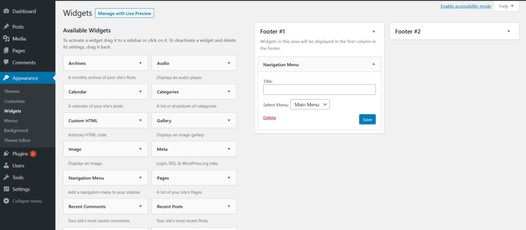
Creating a user-friendly navigation menu is essential for enhancing user experience and facilitating seamless browsing on a WordPress website. A well-structured menu not only guides visitors through the site but also plays a significant role in search engine optimization. When designing a navigation menu, several key factors should be taken into consideration to ensure functionality and aesthetic appeal.One of the primary aspects of effective navigation design is simplicity.
A clear and concise menu structure allows users to quickly understand where to find the information they seek. Below are some key factors that contribute to a user-friendly navigation menu:
Key Factors for User-Friendly Navigation Menus
To increase the effectiveness of your navigation menu, consider the following best practices:
- Limit Menu Items: Aim for a maximum of seven main items to avoid overwhelming users. Too many options can lead to confusion and decision fatigue.
- Use Descriptive Labels: Choose clear and descriptive labels for menu items. For example, instead of using “Products,” use “Shop All Products” to provide clarity.
- Organize Hierarchically: Implement a logical structure where related items are grouped together. For instance, place “Men’s Clothing” and “Women’s Clothing” under a parent category called “Clothing.”
- Include a Search Functionality: Adding a search bar to your navigation menu can help users find specific content quickly, particularly on larger sites.
- Prioritize Important Items: Position the most critical menu items in prominent locations, such as the top left or center, where users tend to look first.
An effective navigation structure can be illustrated through various layouts. For example, a horizontal menu bar at the top of the page is commonly used, providing easy access to main categories. Alternatively, a vertical side menu can be suitable for websites with extensive subcategories, allowing for a clear distinction between different sections.
Examples of Effective Navigation Structures
When designing navigation menus, examining successful examples can provide insights into what works well. Here are a few effective navigation structures:
- eCommerce Websites: Many eCommerce sites, such as Amazon, utilize mega menus that reveal subcategories upon hovering. This allows users to explore various product categories without cluttering the main menu.
- Blogs and News Sites: Websites like Medium employ a clean, minimalistic top navigation bar with only four to five key sections, directing users to essential content categories.
- Corporate Websites: Corporations often use a combination of horizontal and vertical menus. For instance, the main navigation can be horizontal while secondary options such as “About Us” or “Contact” appear in a sidebar.
Testing and Gathering Feedback on Navigation Menu Effectiveness
To ensure your navigation menu is serving its purpose effectively, it is vital to conduct usability testing and gather user feedback. Monitoring how users interact with the navigation can provide insights into potential issues or areas for improvement. Utilize the following methods:
- User Testing: Conduct sessions where real users navigate your site while being observed. Take notes on their behavior, challenges, and feedback.
- Analytics Tools: Leverage analytics tools like Google Analytics to monitor which menu items are most frequently clicked and which are ignored. This data can inform adjustments to your navigation structure.
- Surveys and Feedback Forms: Implement feedback forms on your website to gather direct input from users regarding their navigation experience.
- A/B Testing: Experiment with different menu designs or structures to identify which version yields better user engagement and satisfaction.
“A well-designed navigation menu is not just about aesthetics; it is about creating a path for your users to follow seamlessly.”
Last Word
In conclusion, mastering the art of creating a navigation menu in WordPress not only enhances the overall aesthetic of your website but also significantly improves user engagement. By following the Artikeld steps and implementing the suggested best practices, you can ensure that your navigation menu serves its purpose effectively while providing an excellent user experience. Remember, a well-designed navigation menu is key to retaining visitors and helping them find the information they seek effortlessly.